We then put each board (of 7 pieces of wood) into a vacuum bag and waited overnight.
We all bent our boards in a curved line; which represented calmness and stability when we skateboard.
The board hardened in 24 hours.
I altered the form of my board by shaving the wood off using a yellow shaver. The shaver has a sharp physical texture.
(clement shaving his board)
The board was initially very rough and had many pocks in the wood. I started using 60 (coarse) sandpaper to sand the board.
After a few days worth of sanding, the board became noticeable smoother.
Some techniques that I thought really saved me time, was the sanding in one direction, not focusing in one spot and spending the most time on 60 and 120. The 220 and 90 are not too important in my opinion. the 400 had to be worked on to get the shine. The times i applied art skills was sanding in a straight line, which added underlining emotions of speed. Another example is using only a 400 on the top of my board, leaving the veins intact, but having a glossy surface.
I felt I have achieved a smooth surface on both the top and bottom of my board because when i held it at an angle, it shimmered in the sunlight (like glass)
Wednesday, December 15, 2010
Saturday, December 11, 2010
Wednesday, November 10, 2010
Monday, November 1, 2010
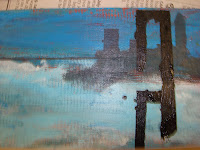
The elements of design i used was tone to make the illusion of space on the picture plane, in the mountains of my masterpiece. I used zigzag lines to create movement in my mountain, and curvy lines in my sky to add calmness. I thought these two contrasts helped added to my masterpiece.
Using the things from one of the artist i talked about, i used small brush strokes to add texture to it. Unforunatly, i didnt think i was carefull with my strokes and smudged a few bits. i experimented with different techniques like this such as using a paper towel to add physical texture to my clouds.
The trees in the front of the picture plane are larger that the mountains adding to the illusion of depth.by adding shading, i made the 2d mountains look 3d.
My painting was overall very cool color based.
Two skills i learn t, was how to use wet coats of paint to make a sky. Even though i preferred to dry brush, i was willing to take a risk in a leap of a faith. This added to my abilties as a painter, and i found it very helpful.
The second skill was layering the paint so that different colors popped out of the picture plane, as the background color had a large effect on the paining. Also i learned why green and red make black.
I could have improve on was my divisiveness.
I honestly thought that these past few days, i was very indecive and could not choose which colors i wanted to make for my painting. This set me very behind, but it has taught me that i have to take a leap of faith, but in a direction that is more generally safe.
Sunday, October 31, 2010
THE PROCCESS PHOTOS!
D. F. Gray
Canadian.
I found his painting fabulous because of the white, blues and red that creates the illusion of the shimmering water, he does this same technique with his sky, but it makes his sky not shimmer, but rush toward the veiwer.
i believe i could do a similar technique by make small, but careful brush strokes using colours with high saturation.
International Landscape apinter
My international landscape painter is Garin Baker.
the aspects of his landscape that i like are how he pushes the intensities of a colour to add contrasts to his master piece. An example of this is in his mountains, the mountains are not light purple, but they are drawn like that because it is how he sees it as something that sticks out in his view. I also like his clean brush stokes for his mountains.
What i could do to make my painting more like his, is to use variations of the same color and use specks of white on the side of his brush allows him to make very crisp bushes with with sun reflections.
Friday, October 29, 2010
Wednesday, October 27, 2010
Sunday, October 24, 2010
Tuesday, October 19, 2010
Friday, October 15, 2010
Tuesday, October 12, 2010
Monday, October 11, 2010
LandScape Drawing Question
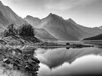
The Elements and Principles of Design were very helpful to me when i was making my drawings. Value (the shading in the boat in the middle of my picture plane and the parallel lines in my trees) helped me achieve a lifelike look to my drawings by adding the illusions of shadows and depth.
Line was applied when i drew my contour drawings to make a Shape of what i was trying to draw.
Shape was applied when i made the shapes in the front of my picture plane bigger than the shapes in the back adding to the illusion of Depth and Space, this could also be called proportion. The cross hatching and parallel lines help add visual texture to my drawing. The Contrast between the sea and the land made the artwork seem more real. Contrast was very important because there was no Color in my piece. I also used Detail with the trees, in the back ground of the Sail Boat, as the trees became less and less detail the farther you looked back.
Printing black and white picture was a good idea as it allowed you not to be distracted by the colour contrast and simply focus on the shading.
What I learned was how to draw lines to make water look real, how to draw grass so it doesn't take too much time but the viewer knows its grass, and how to draw Shadows in the same angle to where the Sun is. One area i need to improve on is my lack of contrast in My Trees. i made a Mistake thinking that the Shadows behind the trees will make it more realistic and less cartoony like the picture show below. But unfortunately it made it very gloomy.
Subscribe to:
Posts (Atom)