Friday, May 27, 2011
Monday, April 18, 2011
My Masterpiece has depth and incorporates warm colors in the front (orange, red) and cool colors in the back (blue).
I also used shading that made the light look like it was coming from the right.
I also added to the illusion of depth by adding more texture in the front and less texture farther in the back. ( example in the grass)
I also used shading that made the light look like it was coming from the right.
I also added to the illusion of depth by adding more texture in the front and less texture farther in the back. ( example in the grass)


Annunciation by Taddeo Gaddi
This painting uses sand colors to effectively build a sense of depth with its rolling hills that appear farther away as it becomes less saturated.
I will use orange more often if i have to paint faces or hands in the sun.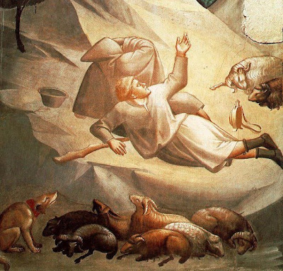
I will use orange more often if i have to paint faces or hands in the sun.


Sunday, April 17, 2011
Peter Brugel

Peter Brugel uses shading to create the illusion of depth. His shading gives volume to his large castle and makes it feel even larger.
The shadows show that the light is coming from one direction. This makes it feel natural.
The colors grow less saturated as it appear farther, adding to the illusion of depth.
I will incorporate warmer colours in the areas with sun, which will make my painting seem more real. I will also imated his style for clouds, they look real.

Summative Summary Of Mathmatical Rennaissance
First we primed out board with layers of white diluted acryilic paint. After sanding lightly with a 400 sandpaper, we brought our drawings and traced it with a soft pencil on tissue paper. We then flipped the image over and retracted the lines so the imprint of the lead would stick to our board.
Unfortunately, I was unable to use this technique effectively and smeared lead all over my wooden panel. I then chose to simply redraw the sketch onto my panel. This proved to be much faster, as i did not have to redraw the image twice; once for the tissue paper and the second to imprint it on the panel.
With a finished drawing on my board, we were given a choice between acrylic or oil paint. I chose oil paint even though it was a different medium and had a infamous record for smearing everything with pigment.
Oil Paint proved to be very good as the paint would take a few days to cure, so i could practice wet-on-wet techniques. This made mixing shades way easier.
I got to a certain point where i covered a majority of the panel with paint, i then started to draw finer details into it. using black and purple, i created shadows and gave the appearance of depth.
I then chose, on a whim, to paint the road blue, turning it into a river.
After some more painting, I finished my master piece. It was good.
Tuesday, April 12, 2011

Tuesday, April 5, 2011
5 Rennecatnt Artworks
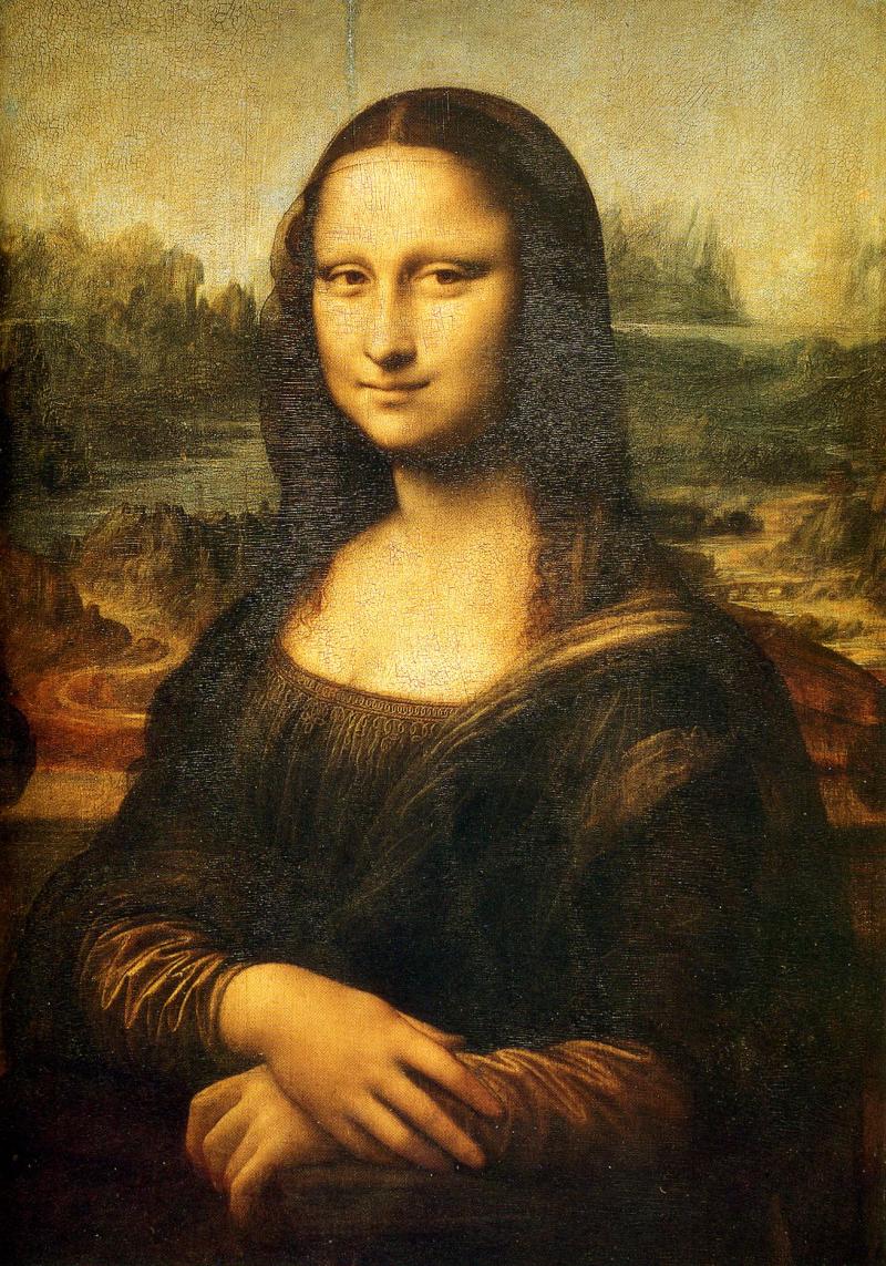
Leonardo da Vinci
Created the Mona Lisa
The paintings bird's eye view of the landscape both contrast and fits with portrait of the Mona Lisa
There is a use of size to add to the illusion of depth, as the landscape that is farther away is smaller relative the the things in front of the picture plane.
The use of warm to cool also adds to the illusion of depth as the warmer colors are in the front makiung the landscape seem closer than the background, mainly composed of colder colours.

The Technique i learned from the Lenordo Davinci is the use of colors and placing the focal point off the picture plane. I also will use colours such as dark blue and green to shade darker area, as black is too strong of a pigment and will muddy all the colors that is near by it.


Summative Oil Painting Mathmatical Artwork
To prime the board, we would first sand the board with a gray 400 sandpaper.
This would remove imperfections and nicks in the grain.
We then painted the board with a thin coat of ghesso, titanium white acrylic paint diluted with water.
This allowed us to make our
This would remove imperfections and nicks in the grain.
We then painted the board with a thin coat of ghesso, titanium white acrylic paint diluted with water.
This allowed us to make our
Thursday, March 31, 2011
Thursday, February 24, 2011
Sunday, February 6, 2011
In the End
I found that, my art was new and challenged the style of my classmates, who used plastic stencils to make their art. I found that tape was a more hands on experience that allowed be to adjust and revise any complications, on the fly. This proved the tape to be both flexible and fun.
Stain i found was both the means to an end and the start to something to new. The stain saved me time appling it, but i found myself waiting long periods of time waiting for it to dry. I then realized that this wasnt the way to put stain on.
Stain i found was both the means to an end and the start to something to new. The stain saved me time appling it, but i found myself waiting long periods of time waiting for it to dry. I then realized that this wasnt the way to put stain on.
Thursday, January 27, 2011


 For the brown top, i used a paper towel to stain evenly, but unfortunately a certain part did not stain well. I thought that i had learned a lot from the mistakes on my board, but unfortunately it is impossible to fix.
for the board bottom, i painted it blue with 2 thick coats, i am very happy about the result and helped push toward the geometric idea of my board.

Tuesday, January 25, 2011

Monday, January 24, 2011
Thursday, January 20, 2011
First Try.
In the design process of my board, i focused on how i applied the paint onto the brown mural paper. This was a different medium for me as i never used a sponge before. The tape was a unique tool to aid me to my goal, as the tape would allow the paint to have straight edged that could not be replicated by brush, but could easily tear the paint by ripping the acrylic off the fibers.
It was essentially a double-edged sword, but i gambled that with practice, i would be able to abuse this technique.
These are my first technique. I found that the purpose of this excecise was to imporve my sponging techniqe and see which designs best-suited my intent of my board.
I found that some tapes were half as sticky as others. these tapes were good tapes.
I also found that peeling the tape off before the paint has dried reduces the chance of it ripping.
Mistakes to be improved on was my messiness, this got my brown paper covered in paint.

YEE
I found that the tape had helped me create a more smooth, clean shape.
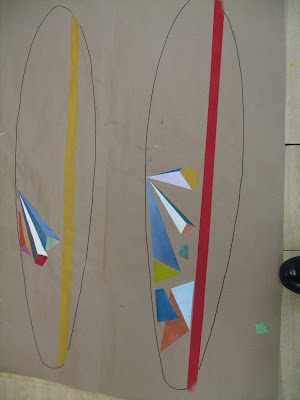
The geometric shape of rectangles, triangles and hexagons was very easy to do with the green masking tape. I found that my design changed from my original idea because i realized that organic shapes are hard to make with the tape, i also found that my sponging techniques became much better after some practice, as the shapes seem spray painted. I feel that the spacing that i put between my shaped allowed it to have lots of contrast. The focal point was where the shapes diverged. I feel that the color band running through my board gives my board a sense of unity.
The vibrancy of my colors were deliberately dulled to not make each individual design stand out. My only tools were the sponge, paint, pen, and most importantly, green tape. The shapes were very simplistic and helped me achieve my goal.
I USED negative space when i space the acrylic shapes of each of them apart.
Colours i used was
Blue+W+W+W+W= Glacier Blue
Yellow+Blue+yellow+neon yellow+white= Dulled Neon Green
Blue+blue+blue+red+yellow+red= This purplish color.
GOLDEN BRONZE+yellow= GOLD
Red+Red+ yellow = Bloody Grapefruit.

Monday, January 17, 2011
Colour!!!!!

COLOUR FOR TWO OF DEM
i tried to use color to acheive unity in my early designs.
th designs that i used had the focal point in the middle. the curvy lines added thethemesof depht and a sense of calmness


If you noticed, The Posts have been scattered. This is because I cannot login through when my Email defaults are Jorgenwong@crescentschool.org
My solution was to use the 2rd link at Google, the >>Change Email>> then go to the first link, Refresh and I put the Browser Cookies from before so i could log in. I then logged in.
My Internet is bad.....
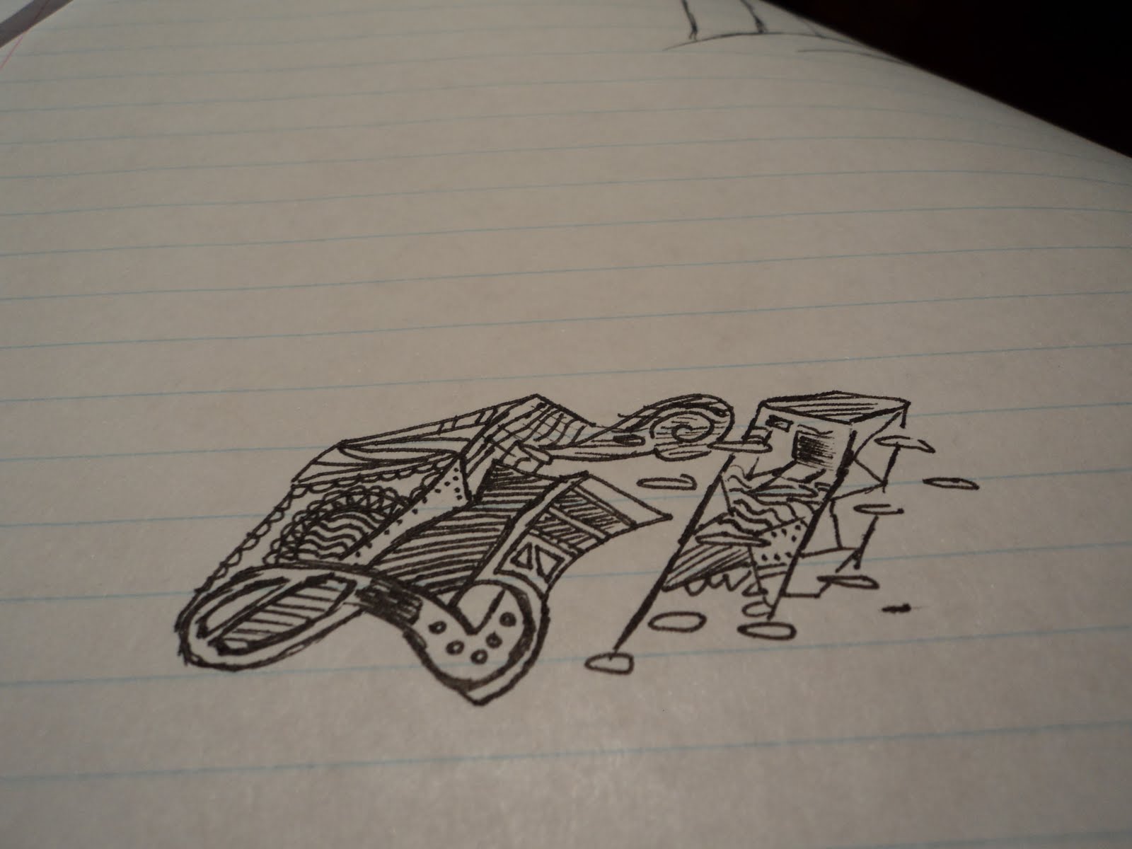
This was my first Sketch of the Pictures (smallest file)\
These thumbnail drawings are black and wite because i use tracing papr to help me choose a color i thought fit my theme. My medium was paper, and a pencil. i tryied to have unity in my masterpiece by having the focal poin in the middle.

Subscribe to:
Posts (Atom)