Sunday, October 31, 2010
THE PROCCESS PHOTOS!
D. F. Gray
Canadian.
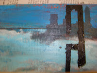
I found his painting fabulous because of the white, blues and red that creates the illusion of the shimmering water, he does this same technique with his sky, but it makes his sky not shimmer, but rush toward the veiwer.
i believe i could do a similar technique by make small, but careful brush strokes using colours with high saturation.
International Landscape apinter
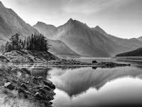
My international landscape painter is Garin Baker.
the aspects of his landscape that i like are how he pushes the intensities of a colour to add contrasts to his master piece. An example of this is in his mountains, the mountains are not light purple, but they are drawn like that because it is how he sees it as something that sticks out in his view. I also like his clean brush stokes for his mountains.
What i could do to make my painting more like his, is to use variations of the same color and use specks of white on the side of his brush allows him to make very crisp bushes with with sun reflections.
Friday, October 29, 2010
Wednesday, October 27, 2010
Sunday, October 24, 2010
Tuesday, October 19, 2010
Friday, October 15, 2010
Tuesday, October 12, 2010
Monday, October 11, 2010
LandScape Drawing Question
The Elements and Principles of Design were very helpful to me when i was making my drawings. Value (the shading in the boat in the middle of my picture plane and the parallel lines in my trees) helped me achieve a lifelike look to my drawings by adding the illusions of shadows and depth.
Line was applied when i drew my contour drawings to make a Shape of what i was trying to draw.
Shape was applied when i made the shapes in the front of my picture plane bigger than the shapes in the back adding to the illusion of Depth and Space, this could also be called proportion. The cross hatching and parallel lines help add visual texture to my drawing. The Contrast between the sea and the land made the artwork seem more real. Contrast was very important because there was no Color in my piece. I also used Detail with the trees, in the back ground of the Sail Boat, as the trees became less and less detail the farther you looked back.
Printing black and white picture was a good idea as it allowed you not to be distracted by the colour contrast and simply focus on the shading.
What I learned was how to draw lines to make water look real, how to draw grass so it doesn't take too much time but the viewer knows its grass, and how to draw Shadows in the same angle to where the Sun is. One area i need to improve on is my lack of contrast in My Trees. i made a Mistake thinking that the Shadows behind the trees will make it more realistic and less cartoony like the picture show below. But unfortunately it made it very gloomy.
Wednesday, October 6, 2010
Subscribe to:
Comments (Atom)


