Thursday, January 27, 2011
 For the brown top, i used a paper towel to stain evenly, but unfortunately a certain part did not stain well. I thought that i had learned a lot from the mistakes on my board, but unfortunately it is impossible to fix.
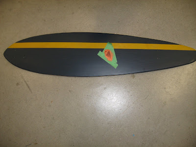
for the board bottom, i painted it blue with 2 thick coats, i am very happy about the result and helped push toward the geometric idea of my board.

Tuesday, January 25, 2011
Monday, January 24, 2011
Thursday, January 20, 2011
First Try.
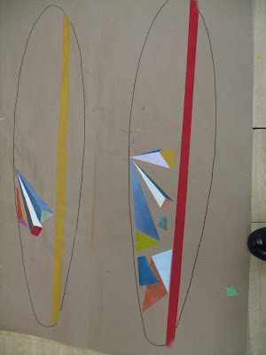
In the design process of my board, i focused on how i applied the paint onto the brown mural paper. This was a different medium for me as i never used a sponge before. The tape was a unique tool to aid me to my goal, as the tape would allow the paint to have straight edged that could not be replicated by brush, but could easily tear the paint by ripping the acrylic off the fibers.
It was essentially a double-edged sword, but i gambled that with practice, i would be able to abuse this technique.
These are my first technique. I found that the purpose of this excecise was to imporve my sponging techniqe and see which designs best-suited my intent of my board.
I found that some tapes were half as sticky as others. these tapes were good tapes.
I also found that peeling the tape off before the paint has dried reduces the chance of it ripping.
Mistakes to be improved on was my messiness, this got my brown paper covered in paint.

YEE
I found that the tape had helped me create a more smooth, clean shape.
The geometric shape of rectangles, triangles and hexagons was very easy to do with the green masking tape. I found that my design changed from my original idea because i realized that organic shapes are hard to make with the tape, i also found that my sponging techniques became much better after some practice, as the shapes seem spray painted. I feel that the spacing that i put between my shaped allowed it to have lots of contrast. The focal point was where the shapes diverged. I feel that the color band running through my board gives my board a sense of unity.
The vibrancy of my colors were deliberately dulled to not make each individual design stand out. My only tools were the sponge, paint, pen, and most importantly, green tape. The shapes were very simplistic and helped me achieve my goal.
I USED negative space when i space the acrylic shapes of each of them apart.
Colours i used was
Blue+W+W+W+W= Glacier Blue
Yellow+Blue+yellow+neon yellow+white= Dulled Neon Green
Blue+blue+blue+red+yellow+red= This purplish color.
GOLDEN BRONZE+yellow= GOLD
Red+Red+ yellow = Bloody Grapefruit.

Monday, January 17, 2011
Colour!!!!!

If you noticed, The Posts have been scattered. This is because I cannot login through when my Email defaults are Jorgenwong@crescentschool.org
My solution was to use the 2rd link at Google, the >>Change Email>> then go to the first link, Refresh and I put the Browser Cookies from before so i could log in. I then logged in.
My Internet is bad.....
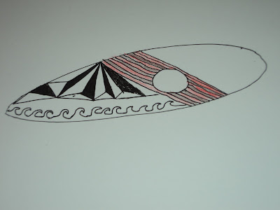
This was my first Sketch of the Pictures (smallest file)\
These thumbnail drawings are black and wite because i use tracing papr to help me choose a color i thought fit my theme. My medium was paper, and a pencil. i tryied to have unity in my masterpiece by having the focal poin in the middle.
Subscribe to:
Comments (Atom)


